What are Data Quality Manager metrics? Identifying the optimal Data Quality Manager metrics can be challenging, especially when everyday tasks consume your time. To help you, we've assembled a list of examples to ignite your creativity.
Copy these examples into your preferred app, or you can also use Tability to keep yourself accountable.
Find Data Quality Manager metrics with AI While we have some examples available, it's likely that you'll have specific scenarios that aren't covered here. You can use our free AI metrics generator below to generate your own strategies.
Examples of Data Quality Manager metrics and KPIs 1. Total Data Volume The total amount of data stored in a database or system, measured in gigabytes or terabytes
What good looks like for this metric: Evaluated monthly; varies by industry
Ideas to improve this metric Regularly audit stored data Use data compression techniques Implement data archiving policies Evaluate data storage solutions Automate data clean-up processes 2. Growth Rate of Data Volume The percentage increase in data over a specific period, typically month-over-month
What good looks like for this metric: Generally should not exceed 5% monthly
Ideas to improve this metric Review data input processes Set growth targets Analyse growth trends Identify unnecessary data accumulation Implement stricter data entry policies 3. Percentage of Duplicate Records The proportion of records that appear more than once in a database
What good looks like for this metric: Aim for less than 1% duplication
Ideas to improve this metric Use data deduplication tools Standardise data entry fields Conduct regular data audits Train staff on data entry Implement unique identifiers 4. Data Accuracy Rate The percentage of data that is correct and free from error
What good looks like for this metric: Should be above 95%
Ideas to improve this metric Conduct regular data quality checks Provide data entry training Utilise automated validation tools Standardise data formats Implement error logging 5. Record Completeness Rate The percentage of records that have all required fields filled out
What good looks like for this metric: Should remain above 90%
Ideas to improve this metric Ensure all required fields are filled Review and update data entry templates Implement data input checks Improve user data input interfaces Incentivise complete data entry
← →
1. Daily Call Logs The number of calls made or received in a day logged for performance assessment
What good looks like for this metric: 100 calls per day
Ideas to improve this metric Set daily or hourly call targets Use scheduling tools to manage call times Incorporate script templates to shorten call times Develop listening skills to enhance understanding Regularly review call outcomes for feedback 2. LinkedIn Reach Outs The number of professional connections and messages sent over LinkedIn to potential clients or partners
What good looks like for this metric: 20 reach outs per day
Ideas to improve this metric Create personalised messages for each connection Leverage mutual connections for introductions Join relevant LinkedIn groups for expanded reach Post relevant content regularly to increase visibility Set aside dedicated time each day for LinkedIn activities 3. Cost Effectiveness The ratio of incentives offered to overall recruit expenses to ensure cost efficiency
What good looks like for this metric: Incentives below 30% of overall costs
Ideas to improve this metric Review and adjust incentive plans regularly Seek alternatives like recognition programs instead of financial incentives Analyse cost-benefit of current incentive structures Negotiate better terms with vendors or service providers Implement performance-based incentives 4. Task Completion The percentage of tasks completed on time, indicating productivity
What good looks like for this metric: 95% task completion rate
Ideas to improve this metric Prioritise tasks using a ranking system Break larger tasks into smaller, manageable steps Utilise project management tools to track progress Set tight deadlines and adhere to them Delegate tasks where possible to ensure efficiency 5. Onboarded Recruits The number of new hires successfully onboarded within a specified time frame
What good looks like for this metric: 5 new recruits onboarded per month
Ideas to improve this metric Streamline onboarding documentation processes Provide detailed training sessions for recruits Ensure all team members are prepared to support new hires Offer feedback sessions to address recruit difficulties Regularly update onboarding procedures
← →
Tracking your Data Quality Manager metrics Having a plan is one thing, sticking to it is another.
Setting good strategies is only the first challenge. The hard part is to avoid distractions and make sure that you commit to the plan. A simple weekly ritual will greatly increase the chances of success.
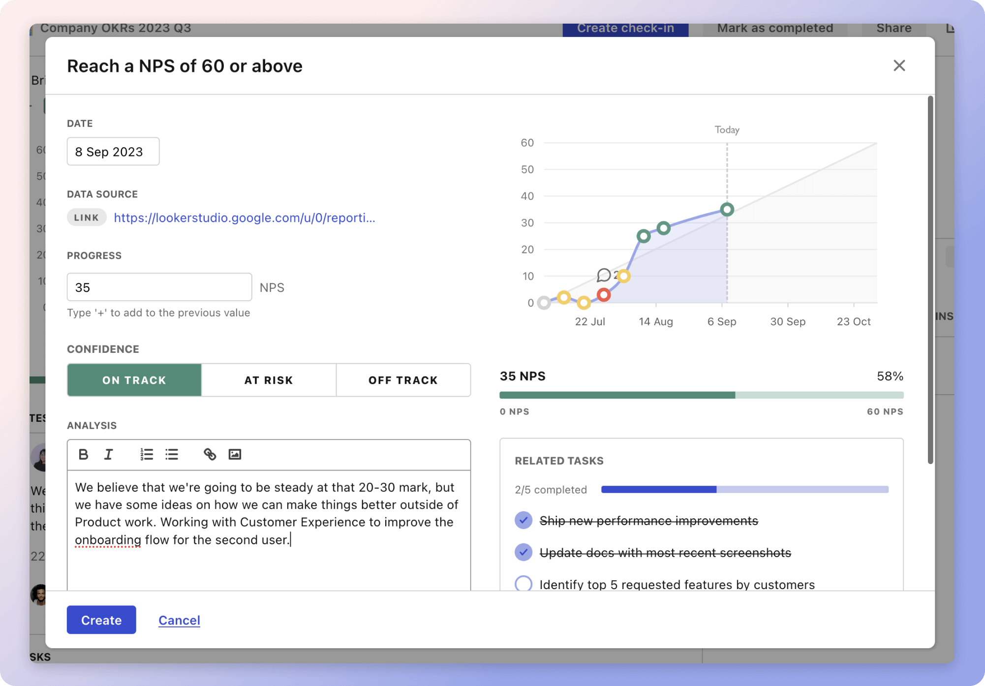
A tool like Tability can also help you by combining AI and goal-setting to keep you on track.
More metrics recently published We have more examples to help you below.
Planning resources OKRs are a great way to translate strategies into measurable goals. Here are a list of resources to help you adopt the OKR framework:
 Tability's check-ins will save you hours and increase transparency
The best metrics for Windows and VMWare Server Support
The best metrics for Routine Staff Training
The best metrics for Data Uptime Measurement
The best metrics for Increasing Revenue and Users
The best metrics for Attract 4 Retainer Clients
The best metrics for Performance Management