What are Readability metrics?
Finding the right Readability metrics can be daunting, especially when you're busy working on your day-to-day tasks. This is why we've curated a list of examples for your inspiration.
Copy these examples into your preferred tool, or adopt Tability to ensure you remain accountable.
Find Readability metrics with AI
While we have some examples available, it's likely that you'll have specific scenarios that aren't covered here. You can use our free AI metrics generator below to generate your own strategies.
Examples of Readability metrics and KPIs
Metrics for Frontend Development Skill Assessment
Tracking your Readability metrics
Having a plan is one thing, sticking to it is another.
Setting good strategies is only the first challenge. The hard part is to avoid distractions and make sure that you commit to the plan. A simple weekly ritual will greatly increase the chances of success.
A tool like Tability can also help you by combining AI and goal-setting to keep you on track.
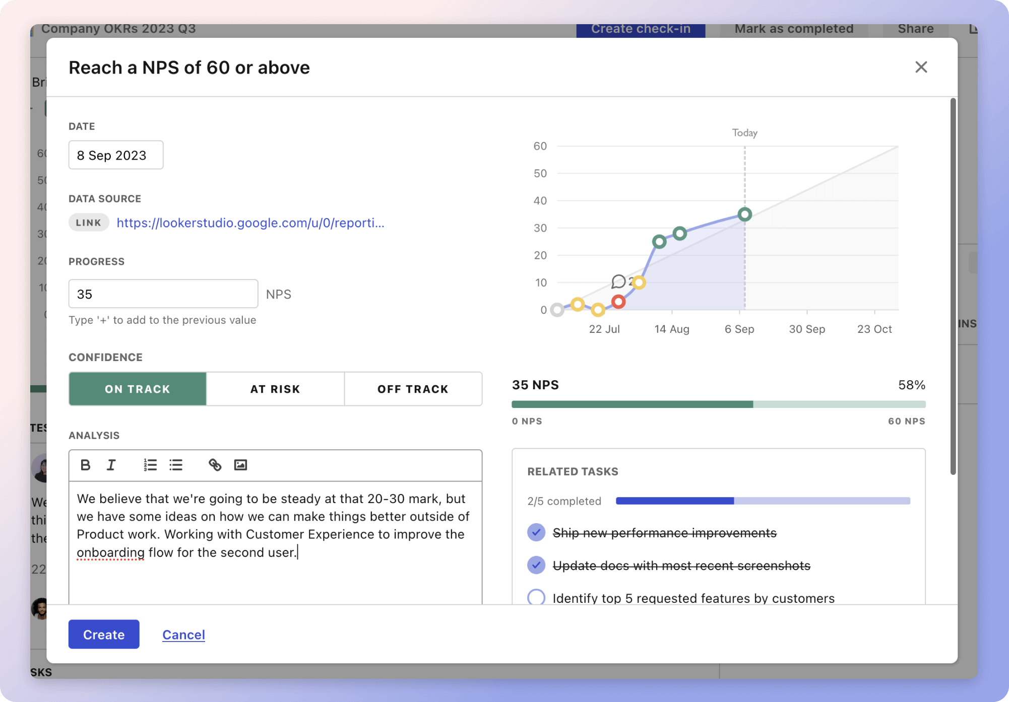
 Tability's check-ins will save you hours and increase transparency
More metrics recently published
We have more examples to help you below.
The best metrics for Windows and VMWare Server Support
The best metrics for Routine Staff Training
The best metrics for Data Uptime Measurement
The best metrics for Increasing Revenue and Users
The best metrics for Attract 4 Retainer Clients
The best metrics for Performance Management
Planning resources
OKRs are a great way to translate strategies into measurable goals. Here are a list of resources to help you adopt the OKR framework:
- To learn: What are OKRs? The complete 2024 guide
- Blog posts: ODT Blog
- Success metrics: KPIs examples