Discover Tability: the AI platform that turns OKRs into resultsLearn more →

User Interface Designer metrics and KPIs

What are User Interface Designer metrics?

Identifying the optimal User Interface Designer metrics can be challenging, especially when everyday tasks consume your time. To help you, we've assembled a list of examples to ignite your creativity.

Copy these examples into your preferred app, or you can also use Tability to keep yourself accountable.

Find User Interface Designer metrics with AI

While we have some examples available, it's likely that you'll have specific scenarios that aren't covered here. You can use our free AI metrics generator below to generate your own strategies.

Examples of User Interface Designer metrics and KPIs

Metrics for Online Bank Account Opening

  • 1. Conversion Rate

    The percentage of visitors to your website who successfully open a bank account online.

    What good looks like for this metric: 5-15%

    Ideas to improve this metric
    • Simplify the online account opening process
    • Improve website speed
    • Enhance clarity of instructions
    • Offer live chat support
    • Test and refine user interface
  • 2. Application Completion Rate

    The percentage of users who start the application process and successfully complete it.

    What good looks like for this metric: Above 80%

    Ideas to improve this metric
    • Make forms shorter and simpler
    • Provide clear progress indicators
    • Reduce mandatory fields initially
    • Allow saving applications for later completion
    • Offer guidance and help during the process
  • 3. Time to Open Account

    The average time it takes for a customer to complete the online account opening process.

    What good looks like for this metric: Less than 10 minutes

    Ideas to improve this metric
    • Streamline verification processes
    • Automate document uploads
    • Use pre-filled forms where possible
    • Minimize user input requirements
    • Provide instant confirmation upon completion
  • 4. Abandonment Rate

    The percentage of users who start but do not complete the online account opening process.

    What good looks like for this metric: Less than 20%

    Ideas to improve this metric
    • Analyze drop-off points in the process
    • Simplify the user journey
    • Send reminders for incomplete applications
    • Offer incentives to complete applications
    • Enhance user experience with feedback opportunities
  • 5. Customer Satisfaction Score

    A measure of how satisfied customers are with the online account opening process, typically obtained through surveys.

    What good looks like for this metric: Above 80%

    Ideas to improve this metric
    • Conduct regular customer surveys
    • Act on feedback to improve processes
    • Ensure help resources are easily accessible
    • Provide tutorials or guides
    • Monitor customer service response times

Tracking your User Interface Designer metrics

Having a plan is one thing, sticking to it is another.

Having a good strategy is only half the effort. You'll increase significantly your chances of success if you commit to a weekly check-in process.

A tool like Tability can also help you by combining AI and goal-setting to keep you on track.
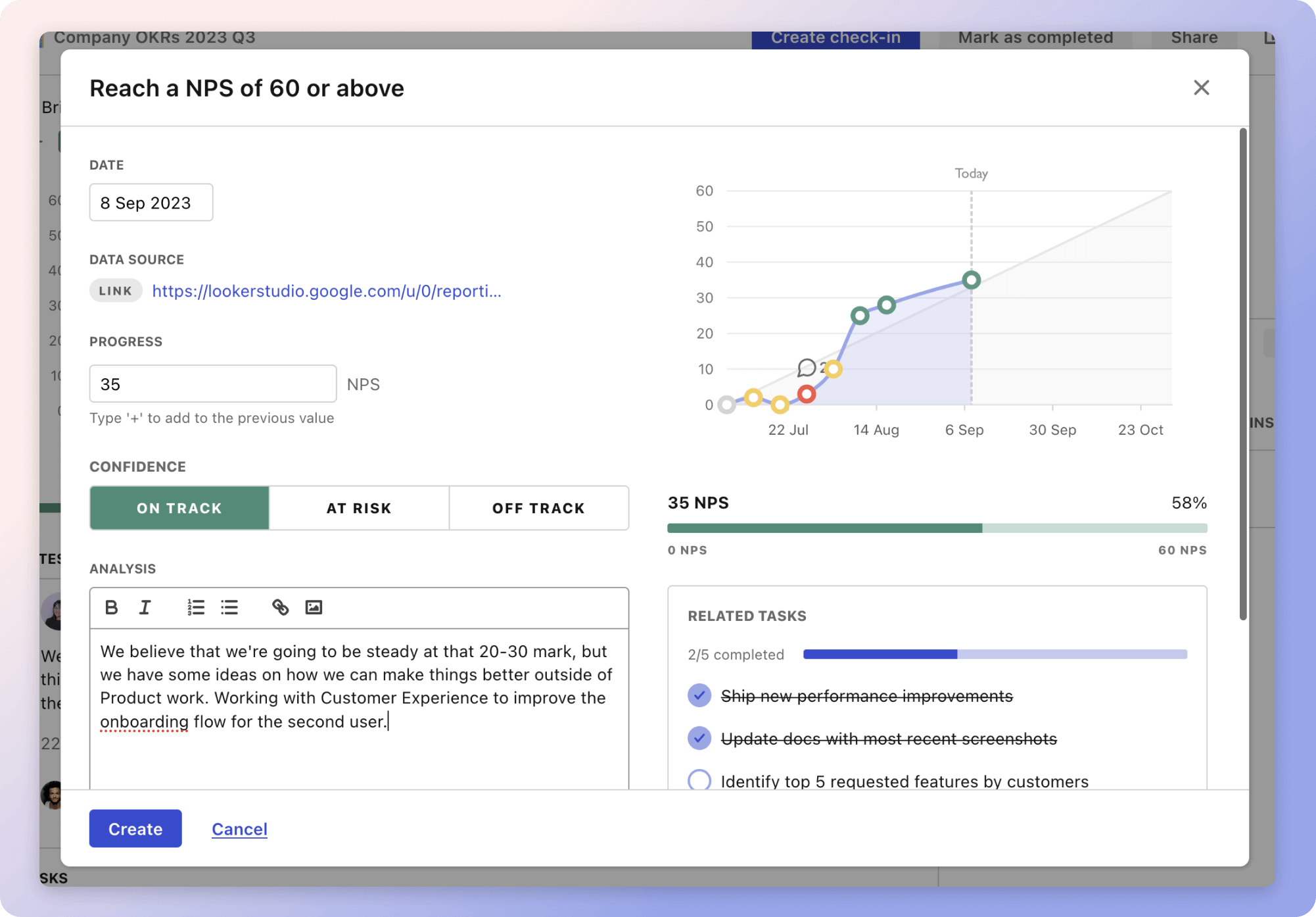
Tability Insights DashboardTability's check-ins will save you hours and increase transparency

More metrics recently published

We have more examples to help you below.

Planning resources

OKRs are a great way to translate strategies into measurable goals. Here are a list of resources to help you adopt the OKR framework:

Table of contents