What are User Engagement metrics? Identifying the optimal User Engagement metrics can be challenging, especially when everyday tasks consume your time. To help you, we've assembled a list of examples to ignite your creativity.
Copy these examples into your preferred app, or you can also use Tability to keep yourself accountable.
Find User Engagement metrics with AI While we have some examples available, it's likely that you'll have specific scenarios that aren't covered here. You can use our free AI metrics generator below to generate your own strategies.
Examples of User Engagement metrics and KPIs 1. Average Session Duration The average time a user spends on the app or website during a single session
What good looks like for this metric: 2-3 minutes
Ideas to improve this metric Enhance content quality Simplify navigation Use engaging media like videos Implement interactive elements Regularly update content 2. Pages Per Session The average number of pages viewed during a single session
What good looks like for this metric: 2-3 pages
Ideas to improve this metric Improve internal linking Use engaging calls-to-action Create content series Offer related content Optimise page load times 3. Bounce Rate The percentage of visitors who navigate away from the site after viewing only one page
What good looks like for this metric: 40-55%
Ideas to improve this metric Improve page loading speed Use compelling headlines Improve mobile optimisation Add engaging multimedia Enhance user experience design 4. Returning User Rate The percentage of users who revisit the app or website
What good looks like for this metric: 30-50%
Ideas to improve this metric Offer loyalty programmes Send regular updates or newsletters Personalise user experience Implement retargeting ads Regularly update content 5. User Interaction Rate The ratio of users who actively engage with interactive elements (e.g., likes, shares, comments)
What good looks like for this metric: 1-3%
Ideas to improve this metric Create engaging posts Incorporate social sharing buttons Host contests or challenges Use call-to-action prompts Respond actively to user comments
← →
1. Data Accuracy Rate Percentage of data correctly recorded as intended.
What good looks like for this metric: 95% or higher
Ideas to improve this metric Implement validation rules for data entry Regularly audit data for errors Provide training for staff on data entry best practices Use automated tools to correct data inaccuracies Ensure regular updates and maintenance of databases 2. Data Completeness Rate Percentage of data records that are complete and not missing information.
What good looks like for this metric: 90% or higher
Ideas to improve this metric Mandate complete entries in forms Conduct regular checks for missing data Simplify data entry processes Provide feedback to team on completeness levels Use data profiling tools to identify gaps 3. Bounce Rate Percentage of visitors who navigate away from a site after viewing only one page.
What good looks like for this metric: 26% to 40%
Ideas to improve this metric Improve page load speed Enhance user experience with intuitive navigation Use engaging and relevant content Implement calls to action and internal linking Utilise targeted landing pages 4. Error Rate Frequency of errors or discrepancies encountered in data processing.
What good looks like for this metric: Less than 3%
Ideas to improve this metric Conduct frequent error checks and audits Use advanced tools for error detection Provide continuous training for personnel Develop a robust data quality management plan Automate error reporting and correction processes 5. Data Validity Extent to which data entries meet specific rules, constraints, and requirements.
What good looks like for this metric: 98% adherence to requirements
Ideas to improve this metric Define clear and specific data entry rules Implement constraints during data collection Regularly update validation protocols Ensure compliance with data standards Utilise software that flags invalid entries
← →
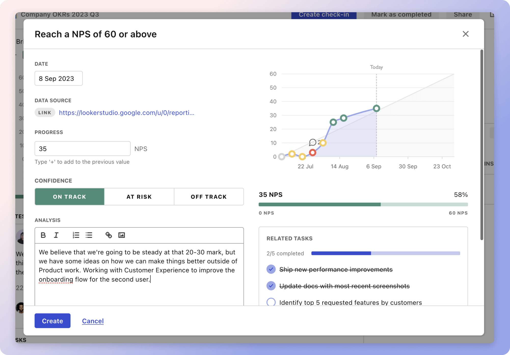
Tracking your User Engagement metrics Having a plan is one thing, sticking to it is another.
Don't fall into the set-and-forget trap. It is important to adopt a weekly check-in process to keep your strategy agile – otherwise this is nothing more than a reporting exercise.
A tool like Tability can also help you by combining AI and goal-setting to keep you on track.
More metrics recently published We have more examples to help you below.
Planning resources OKRs are a great way to translate strategies into measurable goals. Here are a list of resources to help you adopt the OKR framework:
 Tability's check-ins will save you hours and increase transparency
The best metrics for Routine Staff Training
The best metrics for Data Uptime Measurement
The best metrics for Increasing Revenue and Users
The best metrics for Attract 4 Retainer Clients
The best metrics for Performance Management
The best metrics for Empowering Innovation and Service Delivery