Tability is a cheatcode for goal-driven teams. Set perfect OKRs with AI, stay focused on the work that matters.
What are Data Visualization OKRs?
The Objective and Key Results (OKR) framework is a simple goal-setting methodology that was introduced at Intel by Andy Grove in the 70s. It became popular after John Doerr introduced it to Google in the 90s, and it's now used by teams of all sizes to set and track ambitious goals at scale.
Formulating strong OKRs can be a complex endeavor, particularly for first-timers. Prioritizing outcomes over projects is crucial when developing your plans.
To aid you in setting your goals, we have compiled a collection of OKR examples customized for Data Visualization. Take a look at the templates below for inspiration and guidance.
If you want to learn more about the framework, you can read our OKR guide online.
The best tools for writing perfect Data Visualization OKRs
Here are 2 tools that can help you draft your OKRs in no time.
Tability AI: to generate OKRs based on a prompt
Tability AI allows you to describe your goals in a prompt, and generate a fully editable OKR template in seconds.
- 1. Create a Tability account
- 2. Click on the Generate goals using AI
- 3. Describe your goals in a prompt
- 4. Get your fully editable OKR template
- 5. Publish to start tracking progress and get automated OKR dashboards
Watch the video below to see it in action 👇
Tability Feedback: to improve existing OKRs
You can use Tability's AI feedback to improve your OKRs if you already have existing goals.
- 1. Create your Tability account
- 2. Add your existing OKRs (you can import them from a spreadsheet)
- 3. Click on Generate analysis
- 4. Review the suggestions and decide to accept or dismiss them
- 5. Publish to start tracking progress and get automated OKR dashboards
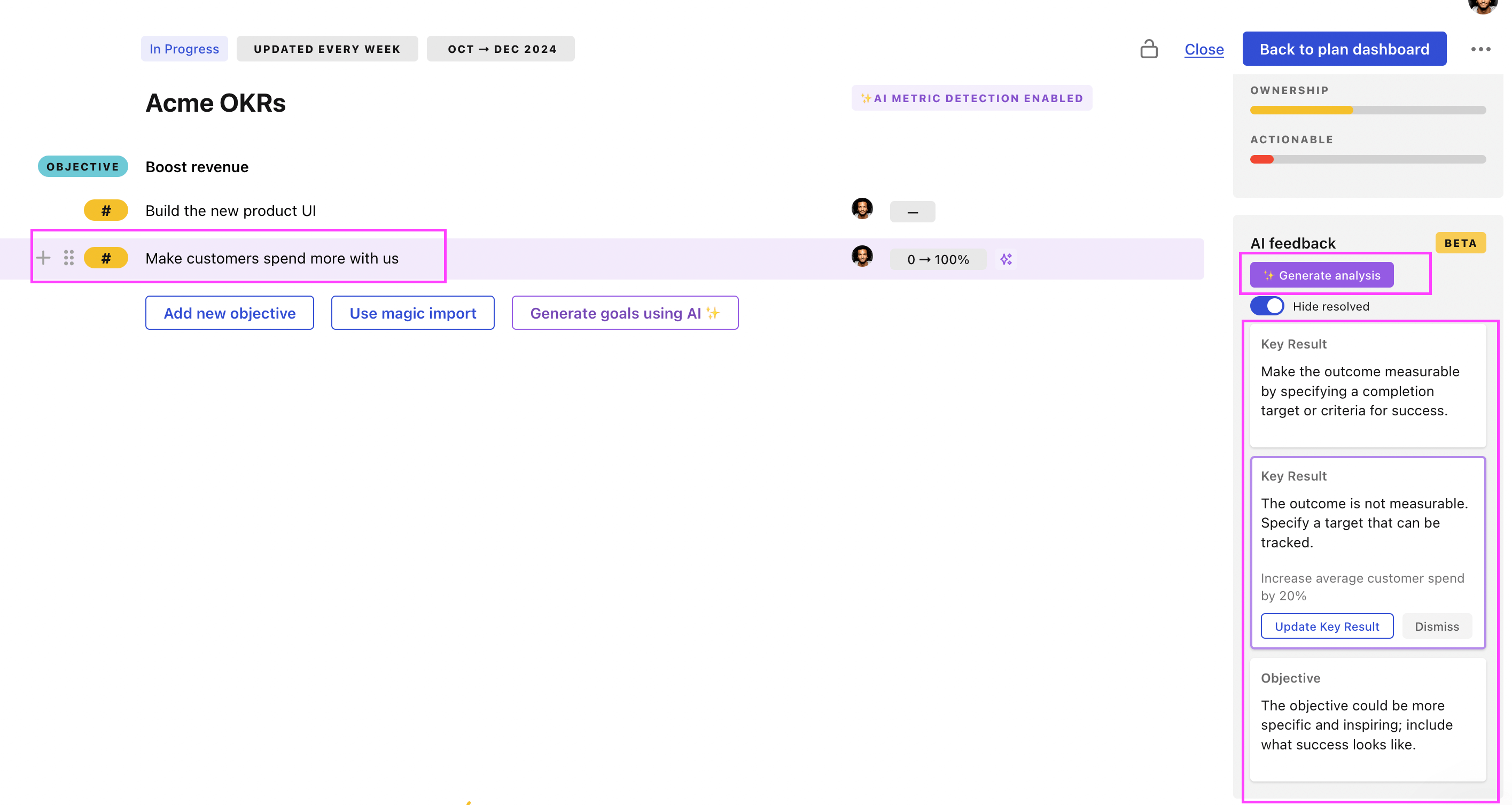
Tability will scan your OKRs and offer different suggestions to improve them. This can range from a small rewrite of a statement to make it clearer to a complete rewrite of the entire OKR.
Data Visualization OKRs examples
We've added many examples of Data Visualization Objectives and Key Results, but we did not stop there. Understanding the difference between OKRs and projects is important, so we also added examples of strategic initiatives that relate to the OKRs.
Hope you'll find this helpful!
OKRs to implement automation in data analysis and visualization
 ObjectiveImplement automation in data analysis and visualization
 KRCreate an automated data visualization tool generating 3 visually impacting reports weekly
 Identify key data points for weekly visualization
- Design three types of impactful report templates
- Program automation for weekly report generation
- KRSuccessfully automate 50% of routine data analysis tasks to increase efficiency
- Implement and test chosen automation tools
- Identify routine data analysis tasks suitable for automation
- Research and select relevant automation software
- KRDevelop a robust data cleaning and pre-processing automation script by the end of Q1
- Design algorithm for automation script
- Implement and test the automation script
- Identify necessary data cleaning and preprocessing steps
OKRs to implement tech solutions to optimize consulting business
- ObjectiveImplement tech solutions to optimize consulting business
- KRReduce response times to client queries by 30% using AI-based Automation
- Implement AI-powered customer service bots for quick query resolution
- Regularly monitor and fine-tune AI algorithms for efficiency
- Train AI systems using previous client interactions data
- KRImprove data analysis efficiency by 40% adopting data visualization tools
- Identify key metrics for data analysis efficiency measurement
- Train team members to effectively use these tools
- Research and select proper data visualization tools
- KRIncrease project turnover by 20% utilizing new project management software
- Research and acquire suitable project management software
- Monitor and analyze project turnover rate regularly
- Train team members on new software usage
OKRs to broaden creative and innovative capabilities in sales reporting analytics
- ObjectiveBroaden creative and innovative capabilities in sales reporting analytics
- KRImplement at least three new creative reporting strategies in daily work
- Select three innovative reporting strategies to apply
- Integrate new strategies into daily reporting tasks
- Research latest trends and tools in creative reporting strategies
- KRComplete two online courses on innovative business analysis techniques by quarter-end
- Schedule and dedicate time for coursework completion
- Enroll in selected online courses
- Research and select two suitable online business analysis courses
- KRImprove existing sales reports by incorporating data visualization techniques learned
- Test and adjust new visual elements for user-friendliness
- Review learned data visualization techniques and their applications
- Apply appropriate visual techniques to enhance current sales reports
Data Visualization OKR best practices
Generally speaking, your objectives should be ambitious yet achievable, and your key results should be measurable and time-bound (using the SMART framework can be helpful). It is also recommended to list strategic initiatives under your key results, as it'll help you avoid the common mistake of listing projects in your KRs.
Here are a couple of best practices extracted from our OKR implementation guide 👇
Tip #1: Limit the number of key results
The #1 role of OKRs is to help you and your team focus on what really matters. Business-as-usual activities will still be happening, but you do not need to track your entire roadmap in the OKRs.
We recommend having 3-4 objectives, and 3-4 key results per objective. A platform like Tability can run audits on your data to help you identify the plans that have too many goals.
Tip #2: Commit to weekly OKR check-ins
Don't fall into the set-and-forget trap. It is important to adopt a weekly check-in process to get the full value of your OKRs and make your strategy agile – otherwise this is nothing more than a reporting exercise.
Being able to see trends for your key results will also keep yourself honest.
Tip #3: No more than 2 yellow statuses in a row
Yes, this is another tip for goal-tracking instead of goal-setting (but you'll get plenty of OKR examples above). But, once you have your goals defined, it will be your ability to keep the right sense of urgency that will make the difference.
As a rule of thumb, it's best to avoid having more than 2 yellow/at risk statuses in a row.
Make a call on the 3rd update. You should be either back on track, or off track. This sounds harsh but it's the best way to signal risks early enough to fix things.
Save hours with automated Data Visualization OKR dashboards
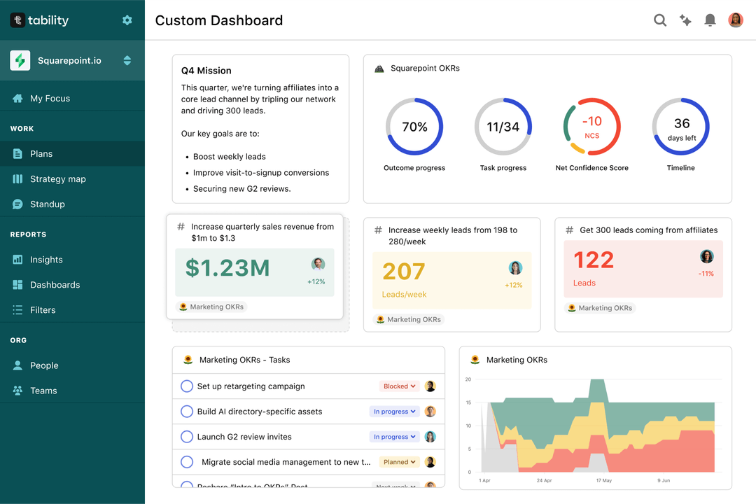
Quarterly OKRs should have weekly updates to get all the benefits from the framework. Reviewing progress periodically has several advantages:
- It brings the goals back to the top of the mind
- It will highlight poorly set OKRs
- It will surface execution risks
- It improves transparency and accountability
Spreadsheets are enough to get started. Then, once you need to scale you can use Tability to save time with automated OKR dashboards, data connectors, and actionable insights.
How to get Tability dashboards:
- 1. Create a Tability account
- 2. Use the importers to add your OKRs (works with any spreadsheet or doc)
- 3. Publish your OKR plan
That's it! Tability will instantly get access to 10+ dashboards to monitor progress, visualise trends, and identify risks early.
More Data Visualization OKR templates
We have more templates to help you draft your team goals and OKRs.
- OKRs to boost overall sales productivity
- OKRs to enhance intuitive feature navigation and findability
- OKRs to implement seamless integration of new product features
- OKRs to develop high-performing distribution teams via effective hiring and onboarding
- OKRs to enhance preventative measures to dissipate potential risks
- OKRs to enhance quality and reach of written content at TechnoStruct Academy