Tability is a cheatcode for goal-driven teams. Set perfect OKRs with AI, stay focused on the work that matters.
What are Website Usability OKRs?
The Objective and Key Results (OKR) framework is a simple goal-setting methodology that was introduced at Intel by Andy Grove in the 70s. It became popular after John Doerr introduced it to Google in the 90s, and it's now used by teams of all sizes to set and track ambitious goals at scale.
Creating impactful OKRs can be a daunting task, especially for newcomers. Shifting your focus from projects to outcomes is key to successful planning.
That's why we have created a list of OKRs examples for Website Usability to help. You can use any of the templates below as a starting point to write your own goals.
If you want to learn more about the framework, you can read our OKR guide online.
The best tools for writing perfect Website Usability OKRs
Here are 2 tools that can help you draft your OKRs in no time.
Tability AI: to generate OKRs based on a prompt
Tability AI allows you to describe your goals in a prompt, and generate a fully editable OKR template in seconds.
- 1. Create a Tability account
- 2. Click on the Generate goals using AI
- 3. Describe your goals in a prompt
- 4. Get your fully editable OKR template
- 5. Publish to start tracking progress and get automated OKR dashboards
Watch the video below to see it in action 👇
Tability Feedback: to improve existing OKRs
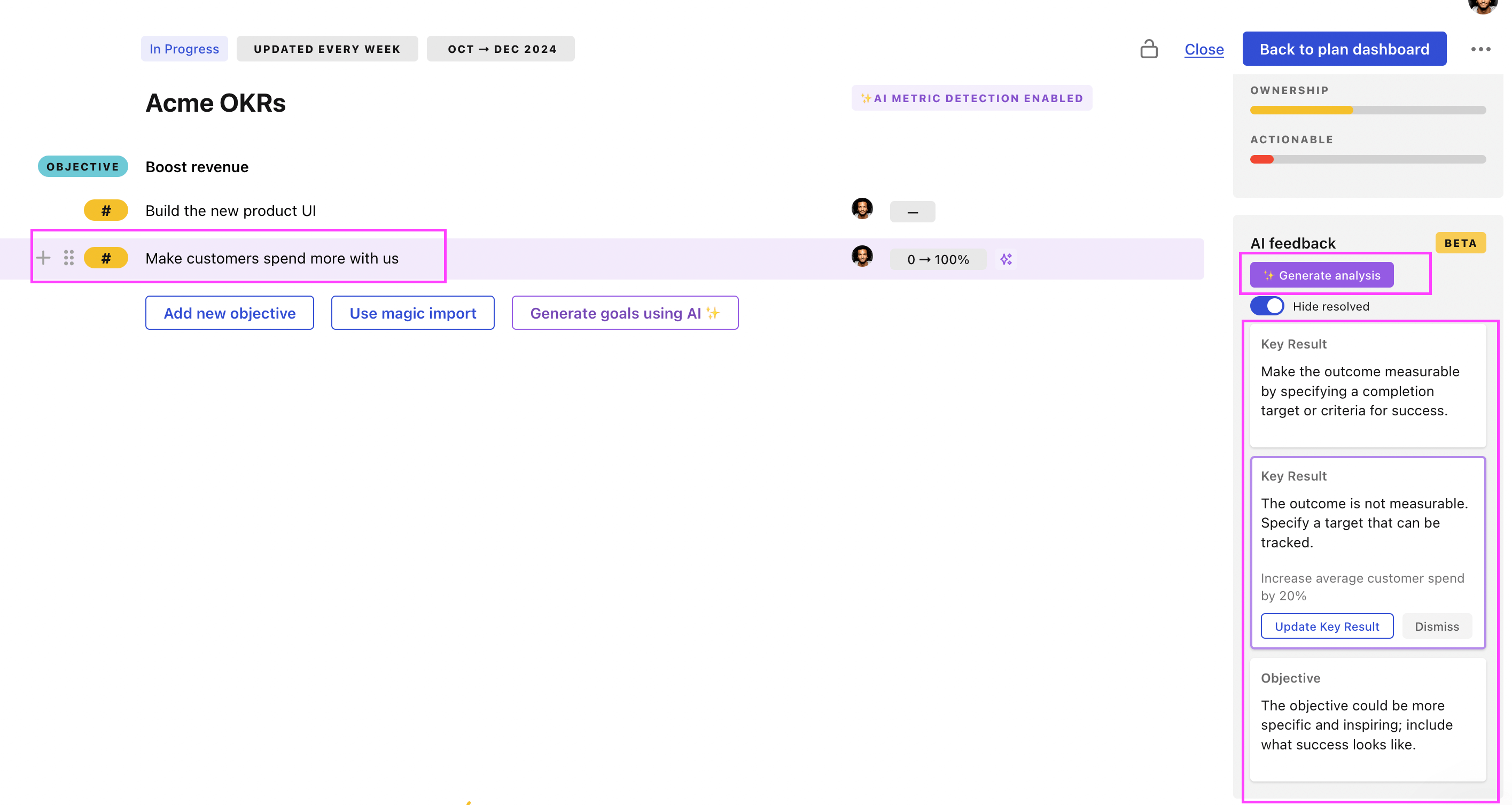
You can use Tability's AI feedback to improve your OKRs if you already have existing goals.
- 1. Create your Tability account
- 2. Add your existing OKRs (you can import them from a spreadsheet)
- 3. Click on Generate analysis
- 4. Review the suggestions and decide to accept or dismiss them
- 5. Publish to start tracking progress and get automated OKR dashboards

Tability will scan your OKRs and offer different suggestions to improve them. This can range from a small rewrite of a statement to make it clearer to a complete rewrite of the entire OKR.
Website Usability OKRs examples
You will find in the next section many different Website Usability Objectives and Key Results. We've included strategic initiatives in our templates to give you a better idea of the different between the key results (how we measure progress), and the initiatives (what we do to achieve the results).
Hope you'll find this helpful!
OKRs to improve website's overall usability
ObjectiveImprove website's overall usability
KRReduce bounce rate by 15%
Redesign website for easy navigation and compelling aesthetics
Offer engaging, relevant, and high-quality content
Increase website speed and mobile compatibility
KRDecrease website load time to 2 seconds or less
Enable browser caching system
Minimize HTTP requests on site
Optimize images and media files for web
KRIncrease session duration by 20%
Optimize website's loading speed and navigation
Add engaging and relevant content to the website
Implement interactive features and multimedia elements
OKRs to enhance technical performance and usability of the website
ObjectiveEnhance technical performance and usability of the website
KRIncrease website traffic by 50% through SEO optimizations
Develop and implement a keyword optimization strategy
Increase the creation of high-quality, SEO-friendly content
Conduct a comprehensive SEO audit to identify improvement areas
KRImplement a responsive design, increasing mobile traffic by 40%
Test and debug mobile functionality regularly
Develop a responsive design layout for optimal mobile browsing
Optimize website speed for mobile users
KRReduce site loading time by 30% to improve user experience
Implement lazy loading for non-critical site elements
Minimize HTTP requests by combining CSS/JavaScript files
Optimize images and multimedia files for faster loading
OKRs to enhance the performance and usability of the technical website
ObjectiveEnhance the performance and usability of the technical website
KRDecrease bounce rate by 35% through optimization of landing pages
Optimize loading speed for enhanced user experience
Implement relevant, attention-grabbing headlines on all landing pages
Provide clear, engaging calls to action
KRImprove website load time by 30% to boost user experience
Enable compression to reduce your HTTP response time
Optimize images and videos for quicker on-page load time
Remove unnecessary plugins that may slow website speed
KRIncrease the site's mobile responsiveness rank by 40%
Optimize images and text sizes for mobile view
Speed up load times to improve mobile usability
Implement a responsive design for better mobile adaptation
OKRs to enhance website usability and comply with accessibility standards
ObjectiveEnhance website usability and comply with accessibility standards
KRAchieve 100% WCAG 2.1 Level AA compliance
Develop and implement a remediation plan based on audit findings
Conduct a comprehensive audit of the current website for WCAG 2.1 compliance
Regularly test the website to ensure ongoing compliance
KRRaise customer satisfaction score on usability to 90%
Regularly update and improve product features
Provide efficient and reliable customer support
Implement a user-friendly interface for easy navigation
KRReduce user task completion time by 20%
Improve server response times
Implement efficient user interface redesign
Streamline workflow processes
OKRs to enhance web usability to boost conversions and lead quality
ObjectiveEnhance web usability to boost conversions and lead quality
KRDecrease bounce rate by 15% via improving website navigation
Implement intuitive, clear, and user-friendly navigation menus
Optimize page loading speed to decrease visitor frustration
Perform user experience testing and make necessary adjustments
KRReduce page load time by 20% to improve user experience
Optimize image sizes to improve webpage loading speeds
Remove unused scripts and unnecessary plugins
Implement Lazy-loading for content elements
KRIncrease conversion rate by 10% through refining call-to-actions
Implement successful changes site-wide
Conduct A/B testing on revised call-to-actions
Review existing call-to-actions for clarity and attraction
Website Usability OKR best practices
Generally speaking, your objectives should be ambitious yet achievable, and your key results should be measurable and time-bound (using the SMART framework can be helpful). It is also recommended to list strategic initiatives under your key results, as it'll help you avoid the common mistake of listing projects in your KRs.
Here are a couple of best practices extracted from our OKR implementation guide 👇
Tip #1: Limit the number of key results
Focus can only be achieve by limiting the number of competing priorities. It is crucial that you take the time to identify where you need to move the needle, and avoid adding business-as-usual activities to your OKRs.
We recommend having 3-4 objectives, and 3-4 key results per objective. A platform like Tability can run audits on your data to help you identify the plans that have too many goals.
Tip #2: Commit to weekly OKR check-ins
Having good goals is only half the effort. You'll get significant more value from your OKRs if you commit to a weekly check-in process.
Being able to see trends for your key results will also keep yourself honest.
Tip #3: No more than 2 yellow statuses in a row
Yes, this is another tip for goal-tracking instead of goal-setting (but you'll get plenty of OKR examples above). But, once you have your goals defined, it will be your ability to keep the right sense of urgency that will make the difference.
As a rule of thumb, it's best to avoid having more than 2 yellow/at risk statuses in a row.
Make a call on the 3rd update. You should be either back on track, or off track. This sounds harsh but it's the best way to signal risks early enough to fix things.
Save hours with automated Website Usability OKR dashboards

The rules of OKRs are simple. Quarterly OKRs should be tracked weekly, and yearly OKRs should be tracked monthly. Reviewing progress periodically has several advantages:
- It brings the goals back to the top of the mind
- It will highlight poorly set OKRs
- It will surface execution risks
- It improves transparency and accountability
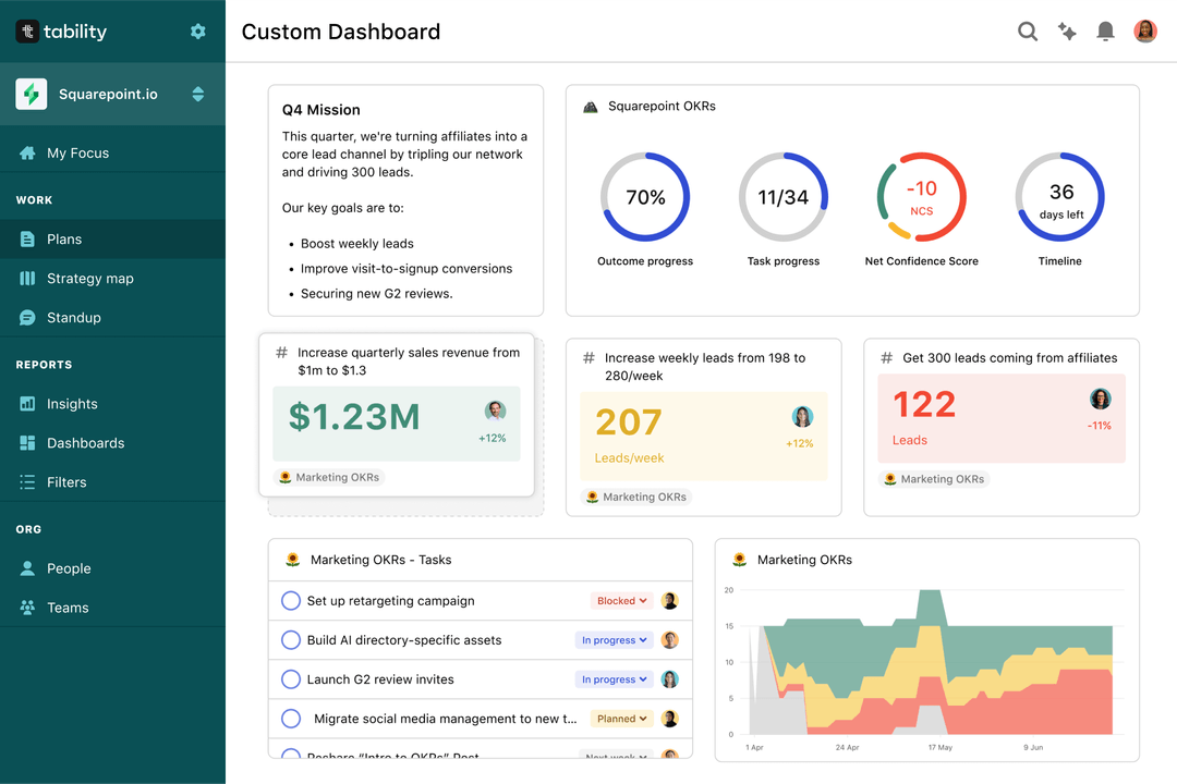
Most teams should start with a spreadsheet if they're using OKRs for the first time. Then, you can move to Tability to save time with automated OKR dashboards, data connectors, and actionable insights.
How to get Tability dashboards:
- 1. Create a Tability account
- 2. Use the importers to add your OKRs (works with any spreadsheet or doc)
- 3. Publish your OKR plan
That's it! Tability will instantly get access to 10+ dashboards to monitor progress, visualise trends, and identify risks early.
More Website Usability OKR templates
We have more templates to help you draft your team goals and OKRs.
OKRs to streamline the onboarding process for rapid integration of new hires
OKRs to execute seamless Data Migration aligned with project plan
OKRs to implement Human Centric Design in our SaaS business
OKRs to amplify employee satisfaction and overall wellbeing
OKRs to boost inbound sales performance
OKRs to enhance travel efficiency and punctuality