Tability is a cheatcode for goal-driven teams. Set perfect OKRs with AI, stay focused on the work that matters.
What are User Friendly Interface OKRs?
The Objective and Key Results (OKR) framework is a simple goal-setting methodology that was introduced at Intel by Andy Grove in the 70s. It became popular after John Doerr introduced it to Google in the 90s, and it's now used by teams of all sizes to set and track ambitious goals at scale.
Creating impactful OKRs can be a daunting task, especially for newcomers. Shifting your focus from projects to outcomes is key to successful planning.
We have curated a selection of OKR examples specifically for User Friendly Interface to assist you. Feel free to explore the templates below for inspiration in setting your own goals.
If you want to learn more about the framework, you can read our OKR guide online.
The best tools for writing perfect User Friendly Interface OKRs
Here are 2 tools that can help you draft your OKRs in no time.
Tability AI: to generate OKRs based on a prompt
Tability AI allows you to describe your goals in a prompt, and generate a fully editable OKR template in seconds.
- 1. Create a Tability account
- 2. Click on the Generate goals using AI
- 3. Describe your goals in a prompt
- 4. Get your fully editable OKR template
- 5. Publish to start tracking progress and get automated OKR dashboards
Watch the video below to see it in action 👇
Tability Feedback: to improve existing OKRs
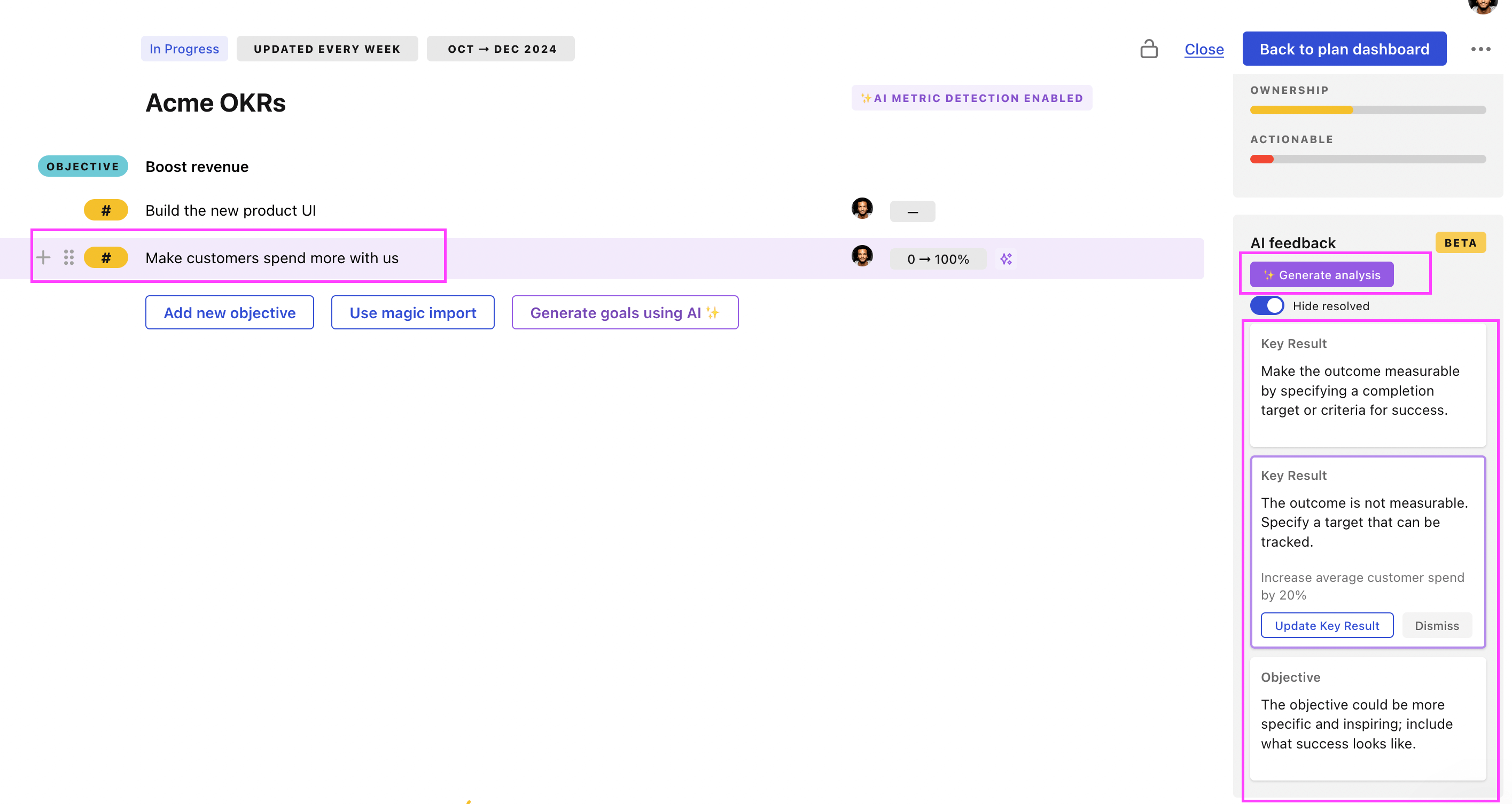
You can use Tability's AI feedback to improve your OKRs if you already have existing goals.
- 1. Create your Tability account
- 2. Add your existing OKRs (you can import them from a spreadsheet)
- 3. Click on Generate analysis
- 4. Review the suggestions and decide to accept or dismiss them
- 5. Publish to start tracking progress and get automated OKR dashboards

Tability will scan your OKRs and offer different suggestions to improve them. This can range from a small rewrite of a statement to make it clearer to a complete rewrite of the entire OKR.
User Friendly Interface OKRs examples
We've added many examples of User Friendly Interface Objectives and Key Results, but we did not stop there. Understanding the difference between OKRs and projects is important, so we also added examples of strategic initiatives that relate to the OKRs.
Hope you'll find this helpful!
OKRs to develop a comprehensive monolingual dictionary for both online and print use
ObjectiveDevelop a comprehensive monolingual dictionary for both online and print use
KRCompile a list of 20,000 words and their meaning by the end of the quarter
Identify reliable sources for word definitions
Allocate daily time for compiling words
Record 222 words and definitions daily
KRCoordinate the production of 200 printed copies of the dictionary
Proofread and finalize dictionary content for print
Schedule pickup or delivery of finished dictionaries
Contact printing company to negotiate price and details for 200 copies
KRDesign and test user-friendly online interface for easy dictionary navigation
Develop a prototype based on approved designs
Sketch design mockups for the dictionary's online interface
Conduct user testing and gather feedback for improvements
OKRs to establish a comprehensive knowledge base
ObjectiveEstablish a comprehensive knowledge base
KRCreate and add detailed content for at least 70 listed topics
Identify and list 70 relevant topics for content creation
Upload and integrate content into the appropriate platform
Draft detailed content for each chosen topic
KRLaunch knowledge base with a user-friendly interface for easy navigation
Design a user-friendly interface for the knowledge base
Test navigation ease on different devices
Initiate marketing for knowledge base launch
KRIdentify and list 100 potential topics to include in the knowledge base
Research industry-related questions and problems
Review existing customer queries and feedback
Seek input from company expert or team leader
OKRs to develop a comprehensive and user-friendly dictionary
ObjectiveDevelop a comprehensive and user-friendly dictionary
KRDesign an intuitive, easy-to-navigate user interface
Test interface usability and adjust accordingly
Sketch layout with clear, easily accessible features
Identify key user tasks for functionality prioritization
KRProcure and integrate 1,000 relevant images to aid understanding
Identify sources for acquiring relevant images
Incorporate images into desired content
Purchase or download 1,000 suitable images
KRDraft at least 10,000 word definitions meeting academic standards
Research academic standards for word definitions
Review and edit definitions for accuracy
Draft 10,000-word academic-standard definitions
OKRs to build a comprehensive and user-friendly HR platform
ObjectiveBuild a comprehensive and user-friendly HR platform
KRDesign and develop an intuitive UI/UX for 1000 active users by the end of the quarter
Implement, test, and improve designed UI/UX
Analyze user behavior and preferences for UI/UX design
Create wireframes and prototypes for new design
KRSuccessfully integrate 5 essential HR modules like recruitment and payroll into the platform
Test and debug the integrated platform regularly
Analyze compatibility of essential HR modules with the platform
Hire professionals for successful module integration
KRAchieve 95% user satisfaction rate measured through a feedback survey
Develop a user-friendly, comprehensive customer satisfaction survey
Initiate efforts to enhance customer service responsiveness
Implement strategies for improving product based on feedback
OKRs to to create an effective web-based project management dashboard
ObjectiveTo create an effective web-based project management dashboard
KRIntegrate with three existing project management tools for versatility
Implement integration and perform testing
Develop integration strategies for each tool
Research capabilities and APIs of three project management tools
KRAchieve zero crash reports within 30 days of the beta test
Introduce continuous monitoring during beta testing
Formulate and implement beta test remediation plans
Develop comprehensive end-to-end testing procedures
KRDesign a user-friendly interface tested by 20 potential users for usability
Conduct usability testing and gather feedback
Select 20 potential users for testing
Create a user-friendly interface draft for testing
OKRs to launch a fully functional React Native application
ObjectiveLaunch a fully functional React Native application
KRPublish the application on relevant platforms (e.g., App Store, Google Play) and achieve a high user rating and positive feedback
KRImplement necessary features and functionalities such as authentication, data storage, and push notifications
Set up a secure and scalable data storage solution for storing user data
Research and choose an authentication method suitable for the project requirements
Test and validate all implemented features and ensure smooth functionality before deployment
Integrate push notification service to deliver real-time updates and improve user engagement
KRConduct thorough and successful testing to ensure the application is robust and bug-free
Collaborate with developers to resolve bugs promptly and retest fixed components
Create a comprehensive test plan with clear objectives and test cases
Conduct regression testing to ensure stability and functionality after bug fixes
Execute test cases meticulously and document any bugs or issues discovered
KRDevelop and deliver a user-friendly and visually appealing interface for the application
Conduct user testing to ensure the interface is intuitive and visually appealing
Conduct user research to identify design preferences and pain points
Collaborate with UX/UI designers to refine and enhance the visual elements
Create wireframes and prototypes to visualize the interface design
OKRs to consolidate all visitor forms into a single accessible location
ObjectiveConsolidate all visitor forms into a single accessible location
KRAchieve a 50% increase in visitor form completion after unification
Implement user-friendly forms with simple, concise instructions
Develop targeted marketing campaigns motivating form completion
Analyze existing form data to identify barriers to completion
KRIdentify and compile all existing separate visitor forms by 15% each week
Locate all existing separate visitor forms
Increase compilation rate by 15% weekly
Compile located visitor forms systematically
KRDevelop a user-friendly, centralized interface for all forms with 0 errors
Construct centralized interface integrating all forms
Conduct thorough UI/UX research for user-friendly interface design
Implement rigorous testing routines to ensure zero errors
OKRs to successfully launch MVP of X new website to the public
ObjectiveSuccessfully launch MVP of X new website to the public
KRComplete detailed project plan, design and development for X website within 4 weeks
Develop the design based on approved project plan within first two weeks
Define clear objectives and create detailed project plan for X website
Finalize website development and conduct testing within remaining two weeks
KRTest the website's functionality and fix bugs for two weeks post-development
Conduct thorough functionality testing on the website
Identify and document any detected bugs
Implement bug fixes and perform retests
KREnsure user friendly interface by conducting a usability test with 50 beta testers
Identify and recruit 50 beta testers for usability testing
Execute usability tests on the interface
Analyze feedback and implement necessary changes
User Friendly Interface OKR best practices
Generally speaking, your objectives should be ambitious yet achievable, and your key results should be measurable and time-bound (using the SMART framework can be helpful). It is also recommended to list strategic initiatives under your key results, as it'll help you avoid the common mistake of listing projects in your KRs.
Here are a couple of best practices extracted from our OKR implementation guide 👇
Tip #1: Limit the number of key results
Focus can only be achieve by limiting the number of competing priorities. It is crucial that you take the time to identify where you need to move the needle, and avoid adding business-as-usual activities to your OKRs.
We recommend having 3-4 objectives, and 3-4 key results per objective. A platform like Tability can run audits on your data to help you identify the plans that have too many goals.
Tip #2: Commit to weekly OKR check-ins
Having good goals is only half the effort. You'll get significant more value from your OKRs if you commit to a weekly check-in process.
Being able to see trends for your key results will also keep yourself honest.
Tip #3: No more than 2 yellow statuses in a row
Yes, this is another tip for goal-tracking instead of goal-setting (but you'll get plenty of OKR examples above). But, once you have your goals defined, it will be your ability to keep the right sense of urgency that will make the difference.
As a rule of thumb, it's best to avoid having more than 2 yellow/at risk statuses in a row.
Make a call on the 3rd update. You should be either back on track, or off track. This sounds harsh but it's the best way to signal risks early enough to fix things.
Save hours with automated User Friendly Interface OKR dashboards

Quarterly OKRs should have weekly updates to get all the benefits from the framework. Reviewing progress periodically has several advantages:
- It brings the goals back to the top of the mind
- It will highlight poorly set OKRs
- It will surface execution risks
- It improves transparency and accountability
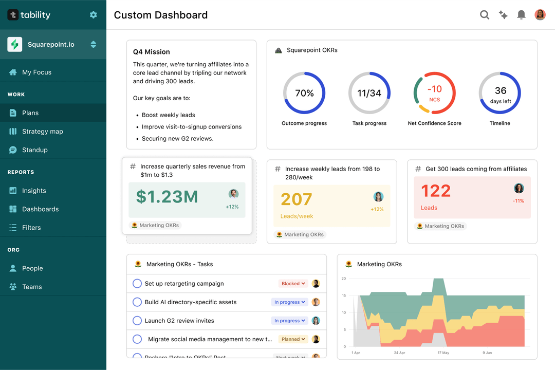
Spreadsheets are enough to get started. Then, once you need to scale you can use Tability to save time with automated OKR dashboards, data connectors, and actionable insights.
How to get Tability dashboards:
- 1. Create a Tability account
- 2. Use the importers to add your OKRs (works with any spreadsheet or doc)
- 3. Publish your OKR plan
That's it! Tability will instantly get access to 10+ dashboards to monitor progress, visualise trends, and identify risks early.
More User Friendly Interface OKR templates
We have more templates to help you draft your team goals and OKRs.
OKRs to boost customer loyalty and extend business footprint
OKRs to enhance Reading Comprehension and Speed
OKRs to enhance the reliability and availability of end-user hardware
OKRs to enhance profit margins through optimized payables management
OKRs to optimize AWS Costs
OKRs to improve project management